
Embracing Adobe
Tutorials for working with Adobe to create our own logos.


This week is Tod discussing finding the right software for your workflow! I admit, finding the right treat for your dog sounds like more fun. But hang with me, I am sure I can find something fun, after all software is starting to get minds of their own, and who knows what they will come up with next?
As writers, we often think about software for writing. But as authors we often need it for more than just writing, and many different creatives have their own software needs or desires.
What software actually helps you with your workflow?
My delving into Adobe was all started by us wanting to do business cards for FenCon, just in case. Speaking of FenCon, is anyone else going next weekend?
So, yesterday, I worked with our new subscription to Adobe. I played with their new AI art software Firefly, their online graphics software Adobe Express, the infamous InDesign, and Premiere Pro. All in one go, so of course, I am a bit tired from the exertion.
Why Adobe?
Why did we go with Adobe? Well, with the single subscription, we get access to every application they provide. This means we only have to learn one ecosystem and one software package for each element of our workflow. (Plus, Anna uses portions of it at work.)
Adobe Premiere Pro
Take for example the dog training videos we post. I’m sure there are other software packages that would both resize, lower the frame rate, and crop the video. I could not find them. The first time I did that, I ended up using three different applications. Sometimes, I know for sure that an application would do more than one action, but it required too much investment in learning and it was perversely easier to download a different application.
With Adobe Premiere Pro, I did it all with one software application. I only had to learn how that one application works and using Perplexity.AI was able to pretty easily look up how to do things.
So, what did I do with the other Adobe applications?
Adobe Firefly
We have Stable Diffusion installed locally and it works great for a lot of image creation. As of this date, almost all the images used previously on the blog were created by our Stable Diffusion installation.
But Stable Diffusion has some issues, among them the potential legal issue of having been trained on art not specifically licensed for training purposes. Adobe Firefly is only trained on art to which Adobe owns all rights, including using it for training.
The result is “safer” software and images, with the tradeoff that getting exactly what you want is different.
With Stable Diffusion, you give it the name of an artist, or multiple artists, and the code statistically combines those styles. It makes it pretty quick and easy to get a style you want.
Firefly does offer a plethora of “styles”. I’m still learning about the results of applying each. But I did discover a set of styles that gets close to the style for our website.
The styles are: Simple, Graphic, Anime, and Cinematic.
Using the prompt “a happy cute newfoundland dog, looking at a round of cheese” we end up with images similar to the one below.
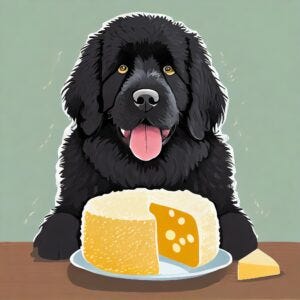
The image is cute enough. But it doesn’t have that fun anime/animation style we like. I played a lot with different prompts and style settings. Finally, I chanced on a change to the prompt. I used the same styles and the same initial portion of the prompt, but I added “, Animation” to the end of the prompt.
For some reason, that gave me images like the one below. Much closer to what we want.
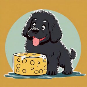
The main difference between what we want and what we got is that the drawing of the Newfie has that white border along the edge. One of my future goals is to learn how to get rid of that.
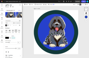
That, however, let me work on a new logo for business cards for FenCon. Both of the below logos are finished products. I unfortunately did not save the initial versions. But I’ll describe how I got the final images momentarily. The Chaos Critter Newfie logo is the happy, slobbery dog we all know and love.

And a Chaos Critter Space Cat logo.

Thus armed, I went forth to Adobe Express for the next steps.
Adobe Express
In Adobe Express, the first thing I did was use the “remove background” option. This works really well when the foreground component is distinct from the background. If the background is one or two colors, the background removal works well too. I have very few if any issues with background getting left in.
This leads to the first reminder. If you need to erase a portion of the image, or remove the background, click on the layer you want to edit. In the example below, there is only one layer, and it is circled in blue.
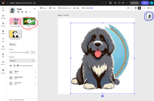
This changes the left side of the screen to offer the Generative Fill, Erase, Remove Background, and other options. If you select somewhere else on the screen, these options are hidden and you cannot find them in the tools on the left. I’m somewhat used to working with layers, but accidentally leaving a layer was too easy here.
I used the eraser to get what Remove Background left behind. Then under Elements -> Shapes, I added the circle behind the Newfie. I changed the interior and border color and made the border thicker. I then sent the circle to the back of the image stack and resized and recentered everything.
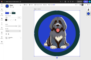
Finally, one of the most painful things I’ve tried to do with other software. I added curved text, that had a different color outlining the letters.
I went to Text -> Add Text and filled in the text field. Then under “Text layout” I clicked on “Arch”. I changed the Fill and Outline colors and Outline thickness. And played with the size and placement. Normally, I’d put the text on the border. But here, I placed it on the Newfie, so you can see the usefulness of the outline, making the text legible even when it crosses light and dark areas.
Since we have the images for the front and back of our business card, we’re almost ready.
I also used Adobes free QR Code (account required) creator to create QR codes for our Blog https://casasent.blog and our Amazon Author page https://amazon.com/author/casasent.
Adobe InDesign
We’re creating business cards with our color laser printer and a box of Avery 5871 business cards. So, I went to Avery and downloaded the InDesign template for this.
The InDesign portion is going to be pretty short. First, to add an image to your work, go to File -> Place. This will prompt you for a file to “place”. (What every other ecosystem calls “insert”.)
You’ll notice once you place the image, it is probably too large or too small. Here is the second and last hint for InDesign for this week. Notice the two arrows, one dark and the other light colored on the left top of the tool strip?
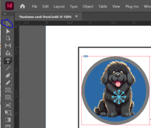
Use the top arrow, circled above in blue. Period. My wife, who uses Illustrator a lot (which has the same setup), removed the second arrow from her tool strip.
The top arrow selects both the Image Frame and the Contents Frame. If you want to resize the image you placed, you want both selected. Selecting just the Image Frame (you’ll see a blue box) means the Contents Frame clips the contents if the image is too big. And changing the Contents Frame (which shows you a red box, just as if both are selected) is way beyond anything we are discussing today.
Oh, please thank Anna for this blog entry existing at all. I didn’t know the names of those components, which made even trying to look up the issue pretty much impossible.
Business Cards
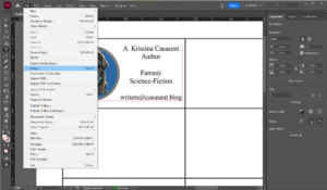
Our business cards ended up looking like this. The front has our author name, the fact that we write cross-genre, and our email.

The back has URLs and QR codes for our blog and our Amazon page. (We recommend always including text URLs as many people do not use QR codes.)

FenCon
That’s it for this week. Hopefully, we’ll see some of you at FenCon.
Feel free to ask for a business card.
~Tod and Anna